I’ve been deep inside of a writing cave for the last 10 days or so. And I don’t think I’ll see much sunlight until the first of April. Not literally. Because that would be damp and probably scary. Plus all of my sweet people still need to eat and be places. Details. But I’m SO excited to give you a sneak peek of what’s to soon come.
I’m finishing up a six-week study based upon the life of Joseph. And I’m pretty sure this may be one of my favorite studies that God has ever led me to write. Though I say that every time I get to write something new.
The title Fruitful Affliction came to me when I read the meaning of Joseph’s second son’s name: Ephraim. Which means, “Twice fruitful.” Or as Joseph proclaims, “For God has made me fruitful in the land of my affliction.” (Genesis 41:52) Wow, I love that God does that.
I had been asking the Lord to show me the title. I wanted it to be from Him, not something I tacked on or conjured up. When I read those words about Ephraim, I knew. Fruitful Affliction.
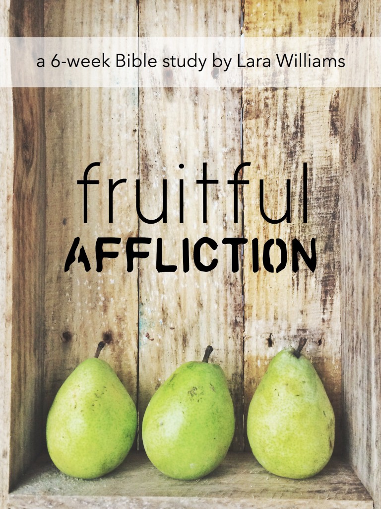
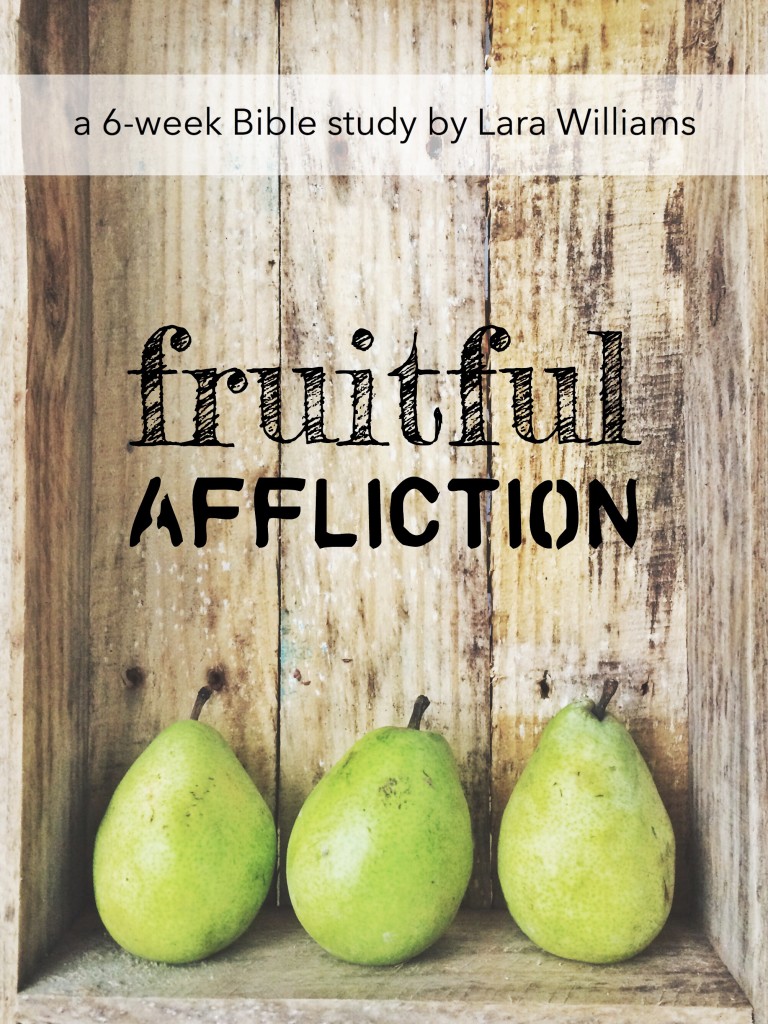
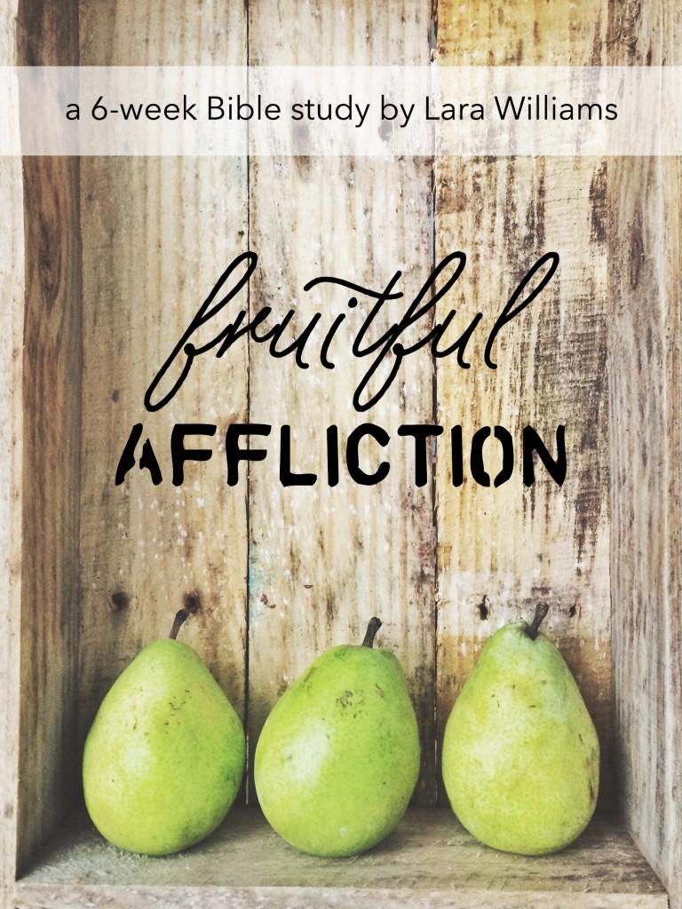
Now, as we design the cover, I’d love your input. And this is really, really important stuff. I mean, life-changing important. I mean…not really. But I’d love to know which font your eyes like best.
Comment below with your vote (“one,” “two,” or “three”) and you will automatically be entered to WIN A PAPERBACK COPY of the study once it releases. (Yay for lucky, randomly chosen, divinely selected you!) The winner will be announced next Monday the 23rd.
I can’t wait to tell you more! Stay tuned…


#2 – it’s bold, but doesn’t overpower the picture. It pops. 🙂
Two. Would love to do this study. Sounds just beautiful.
#2, #2, pick #2! 🙂
I’m going to be different and pick #3. To me it brings or the “beauty” in the affliction
I vote for # 2. It just stands out more to me.
I think 2
#2!!
Definitely #2!
Two. It just fits with the whole design 🙂
I agree with Tricia Ling – go for #3! I’m always sucker for a lovely script. 🙂
Two! Yay for divinely inspired titles!
#3 ~ I totally agree with Tricia.
I like the simpleness of #1, but agree with another commenter about #3. I love the story of Joseph’s life! He lived a life of suffering but knew God was with him always, oh to have that faith!
Two! Very pretty and eye catching for a cover. It’s the inside that I can’t wait to read. Xo
Definitely # 2 – I reading what this is about, there is something the font that speaks to me. How God is filling in the gaps when you are afflicted and you aren’t even aware, but He knows the plans He has for us.
1 or 2- easier to read. And it is amazing that we just talked about Ephraim’s name at length in the study I’m doing, Faith in the Valley. So must good stuff in Joseph’s story. I love it!
#3…reminds of shoe laces and this life is a race we run! Can’t wait to read every word.
Two
TWO!!
ONE! I like how FRUITFUL stands out in the simpler font.
#3
I like two.
Hands down #2!!!! Love it!!!
I like #2.
Two.
#2! Can’t wait for this study!
#2
#2!!! Your bible studies have had such an impact on my walk with Christ and I would love to do this one!
#2 looks best
#1. It looks clean and simple.
#2, it reminds me of fruit crate lettering. Thanks! This sounds like a fascinating study. I look forward to it.
I’m going with 3. Something about it grabs me…
#2 – I don’t know why, but I like that one best!
#2 is my favorite really grabs your eye and makes you wan to read it. Congratulations on the new study!
#1 draws me in.
I like–Two
#1 – it’s the clearest (the last “l” in #2 disappears into the wood grain).
Definitely two!
Can I be totally honest? I would choose a simple font for both words and try it in white. The photo is lovely and I feel like these fonts are a stark contrast to the feel of the photo. Just my two cents 🙂
#three
It is pleasing to my eyes 🙂
I usually prefer the font of #1 but I think the thin lines get a little lost in the grain of the background, so I’d go with #2 this time! Love the name and verse- thanks for sharing.
#2 – love it.
Definitely 2!!!
I like #3 🙂
#3 is my favorite because it displays the contrast of the gentle “fruitful” script with the hardness of “Affliction ” and this is a book which will mostly be read by women.
One. Simple and lovely.
I vote for #2, eye catching and God’s blessings to you.
Two. The fruitful is the easiest to see in two. 🙂
Three definitely
Three
Two
two 🙂
#1 gets my vote
#2
#3… There’s beauty and movement in the letters
One
#2 – love the sketchy look~ double meaning, of course, because Joseph found himself in some pretty sketchy situations!
#2. love it!
I like 3
#2!
Two. It fits with the crate, seems like a roadside stand – the best place to get fresh fruit.
I vote for #2 I think it is the easiest to read
Definitely #2
two is my favorite
i love the clean lines of #1…
TWO!!! Love it!
Loving #3. The print is lovely, a good mixture.
I like #1 and 3. So interesting to see all the comments and how most were drawn to 2 so far.
Two. I like how the letters of “fruitful” are wide = full. This way affliction doesn’t over power the title because both words are the same width.
I like #2. 🙂 Thankful for you, friend.
2. and joseph is my favorite favorite favorite bible guy (besides Jesus). so i’ll buy it even if i don’t win it. so don’t divinely pick me.
I Vote for 3 because of the comment about beauty coming from affliction
#3 – come on lucky random choosing!
Three. I think 1 is too stark in contrast to the natural picture, and 2 gets lost in the grain of the wood – it looks too similar, in my opinion. Can’t wait to read it!
two
Two
I really like the first one.
I like #1.
Three
Two!!! Like the weight of the type and it fits the feel and texture of the background.
Two… although I like all 3 options for fruitful… might like something different for the affliction. : )
#1…keeps it simple. 😉
#2- its the most eye appealing piece. love the idea and love the topic! excited to see the completed project! i LOVE the Ephraim part- ‘Twice fruitful’
I love #2!
Love #3! Fruitful flows so lovely.
#3 🙂
I love #1, reminds of a logo you would find at the bottom of a crate.
#2. It’s interesting yet blends so it didn’t get lost but didn’t seem too intrusive. Pretty perfect combo in my book! Pun not intended 🙂
As a senior my eyes like 1 but the more modern one is 2!! Go with 2
#2 caught my eye immediately. Sounds like a great study!
I like #2!
Two
One
#2. That font just goes with the “earthy” theme better.
Love #2!
I still like 3
I decided on two and then read the comments. Looks like it was a favorite. 🙂
I decided on two and then read the comments. Looks like it is a favorite. 🙂
I choose “one”! Thanks for a chance to win 🙂
#2 catches my eye most!:)
Two!!
#2! It’s easy to read, yet stands out!
#2 is my favorite! Would LOVE to win this!
#3! 🙂 It’s beautiful and I’m so excited to read it when it comes out! Yay!!
#3, makes it more feminine but I would change the bottom font to a plain, bold
serif.
I like 1.